Have you seen any analysis of the NZ data posted by any prominent epidemiologist showing it is safe? I haven’t and it’s been almost 1 year since I set the data free
Sep 02, 2024
Quick summary
This article goes into GREAT detail to explain the safety signals in the data leaked in New Zealand by Barry Young. It takes an hour to read. There are likely some typos…
So here’s the short story…
The NZ data, when analyzed using a gold-standard methodology used by the UK government, clearly shows that the vaccines are increasing all-cause mortality in those who were vaccinated. It’s no more complicated than this:
- when seasonal mortality is strongly declining, the mortality of the vaccinated is increasing.
- when seasonal mortality is strongly increasing, the mortality of the vaccinated is increasing even more.
In short, if you chose to get vaccinated, your mortality increased. The mortality increase happened every time you got a shot. It’s crystal clear.
I’ve looked at other time series data for other vaccines and you simply don’t see this effect so it isn’t an artifact of vaccination (the Healthy Vaccinee effect).
We see the same effect in other countries after a shot is given. Your risk of death increases. Every time. Every country. Every dose. Every season.
The world’s epidemiologists are silent.
None are calling for data transparency.
None have published any written work claiming the New Zealand data proves the vaccines are safe. Is that how science works nowadays? You ignore data you don’t like?
Before I disclosed the NZ data publicly, I offered it to the CDC because they have never seen patient record-level data for a vaccine ever before. They said they didn’t want to see the data.
Even worse is that at a time when data transparency is key to eliminating misinformation, every one of the world’s health authorities refuses to disclose even the bare minimum, a time-series cohort summary report of their own data with weekly buckets and 5 year age categories, that would show the public whether the vaccines are safe or not. Members of Parliament asked the UK ONS for this and were turned down.
The lack of transparency is stunning.
If you want to show whether the vaccine is safe or not, all you have to do is compare the time-series data from New Zealand to the time-series data from a safe vaccine published in a paper in the peer-reviewed literature.
Except for one small problem… no such paper exists because the health authorities refuse to release it.
Why would they do that if the vaccines are safe?
No doctor in the world should be recommending these shots until there is the minimum requisite data transparency of the public health data. There is no excuse for this. The only reason you wouldn’t do this is if you knew you were killing people.
I also showed that even going further than just a time-series dataset and releasing the anonymized underlying patient record level data like I did with the New Zealand data, did not violate anyone’s privacy, yet allows for even deeper analysis than the time-series cohort summary records. That analysis shows the same safety signals as the time-series analysis.
Executive summary
The tragic “died suddenly” deaths will keep happening until health authorities worldwide release the record level data so that everyone can see whether or not there is a link between the COVID vaccines and excess deaths.
Critical thinkers might wonder, “Why aren’t any prominent epidemiologist calling for data transparency of public health data? Don’t they want to know?”
Apparently the answer is “no.” Not a single mainstream epidemiologist in the world is calling for transparency of public health data. As far as I know, it has never happened.
Transparency is easy. The UK ONS did it by exposing the time-series cohort analysis of their data. But they just choose very wide “buckets” that completely obscured the damage. Using smaller buckets, one week in length, would reveal the truth. When I asked Sarah Caul of the UK ONS why they didn’t do this, she didn’t respond even though I cc’ed a member of Parliament on my e-mail. That member of Parliament is now escalating the issue with the ONS. We’ll see how well that works out for the ONS.
We finally have record-level patient data thanks to the efforts of Barry Young, the courageous whistleblower in New Zealand. It’s been publicly available since Nov 30, 2023. Have you noticed that not a single prominent epidemiologist in the world has come out and proclaimed that the NZ data proves the COVID vaccine is safe?
However, people have gone into over-drive to unfairly discredit this data.
In this post, I will show you:
- That there is excess mortality in New Zealand and how you can determine that from the official death numbers.
- That the COVID vaccine,, and not COVID, is the most likely cause of these deaths.
- That a variety of different methods, including a time-series cohort analysis, can be used to show the massive safety signal in the records that Barry released.
If you are looking for a safety signal for a vaccine, it’s really hard to beat a properly done cohort time-series analysis. This is the same method used by the UK Office of National Statistics for analyzing the UK vaccine safety data.
I published all the data and analysis tools for allowing people to prove to themselves that the COVID vaccines are deadly.
However, to date, not a single person in the world has looked at the data and published a proper analysis of what the cohort time-series analysis of the data reveals. They all chose to ignore the time series cohort analysis and do their own, ad hoc analysis. Wow.
More importantly though is this: To date, not a single respected epidemiologist in the entire world has looked at the data and published in written form, anything about it. There is complete silence from the community after this unprecedented release of patient record-level data. They’ve never had any data like this in the history of the world and they completely ignore it!?! That’s the stunning news. It’s objective. No comments. Just silence. With just one exception I’m aware of…
I just learned of a claim from an epidemiologist in New Zealand, Janine Paynter, that there will be two analyses of the data (likely the other being from Helen Petousis-Harris).
I hope they keep their word! But I seriously doubt it.
I predict that these epidemiologists will completely ignore the time-series data, cherry pick an analysis method that will obscure the signal, and then claim “there is nothing to see here” or that because “there is no control group” they can’t determine anything. They will provide no reason for avoiding the time-series methodology.
More likely scenario: They probably won’t even release their report. Ever.
In the time, in this article will show you how to interpret the time-series data.
The bottom line is that there is a very strong increase in the mortality rate of people who got the jab and it is a statistical certainty that this increase was not just random statistical noise. This means they should stop the shots immediately because it is a mathematical certainty that they are increasing all-cause mortality.
The only way the shots should be allowed is if there is at least 95% certainty that the vaccine improve all-cause mortality in the New Zealand. Mark my words: there is simply no chance of that. There is no possible way you can look at this data and come to that conclusion. Mortality rates always climb post-jab, even when seasonality would normally have them decrease
In other words, all the people pushing the shots are either bought off to look the other way or they are simply sheep following the herd and ignoring the record-level data that is now in full public view.
Thank you to Barry Young, the courageous New Zealand whistleblower for exposing the data that made these computations possible. No health authority in the entire world has ever made this information (patient record-level vaccine-death data) publicly available. They all keep it hidden from public view. That should tell you everything you need to know.
This is a dense article
If you aren’t interested in the details, stop reading whenever you want.
Provenance of the data
The tl;dr in this section is that I’ve done nothing illegal, immoral, or unethical. Health New Zealand (HNZ) has refused all requests to explain the data. They are deliberately looking the other way.
I received the data directly from Barry Young. I verified it’s authenticity by randomly selecting data and verifying that it matched the death records for that person. I asked Barry questions that only a DBA would know. Barry’s employer acknowledged that Barry was fired after sending all the top leadership of HNZ that their data showed people were being harmed.
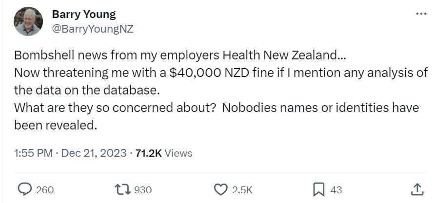
HNZ sought to stop the leaked data from being published. If the data was fake, why would they have bothered to go to extensive lengths to do that. They also threatened certain people in New Zealand with a $40,000 fine if they talk about the data:
I’m a US journalist. Giving me the data is basically publishing the data. This is very similar to Daniel Ellsberg giving the New York Times, The Washington Post, and other newspapers the Pentagon Papers. While Ellsberg was charged with several crimes, all charges against Ellsberg were dismissed due to government misconduct. The newspapers were never charged with a crime. The Nixon administration sought to prevent the publication of the Pentagon Papers through legal means, arguing that it jeopardized national security. They obtained temporary restraining orders but failed to permanently block publication.
Whether Barry Young violated the law will be determined in a court of law, not in a court of public opinion. He has pleaded innocent to the charges brought against him.
What I did in obfuscating the data and publishing my derivative work is not illegal, unethical, or immoral. I have not been charged with any crime nor I have violated any law according to any of the four attorneys I consulted with (just to be sure); two were US attorneys, one based in New Zealand, and one in the UK.
I have contacted HNZ and informed them that analysis of their data by myself and other respected individuals has shown very troubling safety signals that need to be explained. I asked them:
- For a copy of all the vaccine-death analysis that have been done at HNZ so I can see if we got it wrong
- If I could speak with one of their epidemiologists who is familiar with the data so they can explain how our analysis is flawed.
- To make the full data public, e.g., as a time-series data dump that would expose any safety issues but 100% protect patient privacy to eliminate any concern about what the data actually says. The data leak is slightly over 4M records, but the full dataset is over 12M records.
I do not want to spread misinformation. I seek only to engage in a dialog to those responsible for monitoring this information so they can explain to me how all of us who have looked at the data and found it troubling got it wrong
They expressed no interest whatsoever in opening a dialog on what the data itself says.
Everyone, especially in New Zealand, should find this lack of openness and transparency very troubling.
Equally troubling is that not a single epidemiologist in New Zealand is calling for data transparency of public health data. This can be done without jeopardizing patient privacy as I have demonstrated here. Not a single person can identify any of their records.
In short, the epidemiologists in New Zealand are all captured and will never demand that the public health data be made public. Why? Because they will be fired and they need to keep their jobs.
I am speculating that if it becomes known that the HNZ leadership promoted a vaccine which killed thousands of people in New Zealand, faith in the health authorities, government officials, mainstream media, and the medical community would be devastated. This could lead to jail time for the people who deliberately looked the other way and lawmakers who promoted the shots that won’t get re-elected.
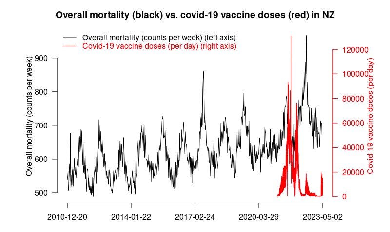
Official New Zealand data shows a huge increase in mortality starting right after the vaccine rollout!
The first thing is we have to show that the overall official mortality numbers in New Zealand show that we have a problem. Then we’ll show you that the data leaked by Barry Young is a smoking gun.
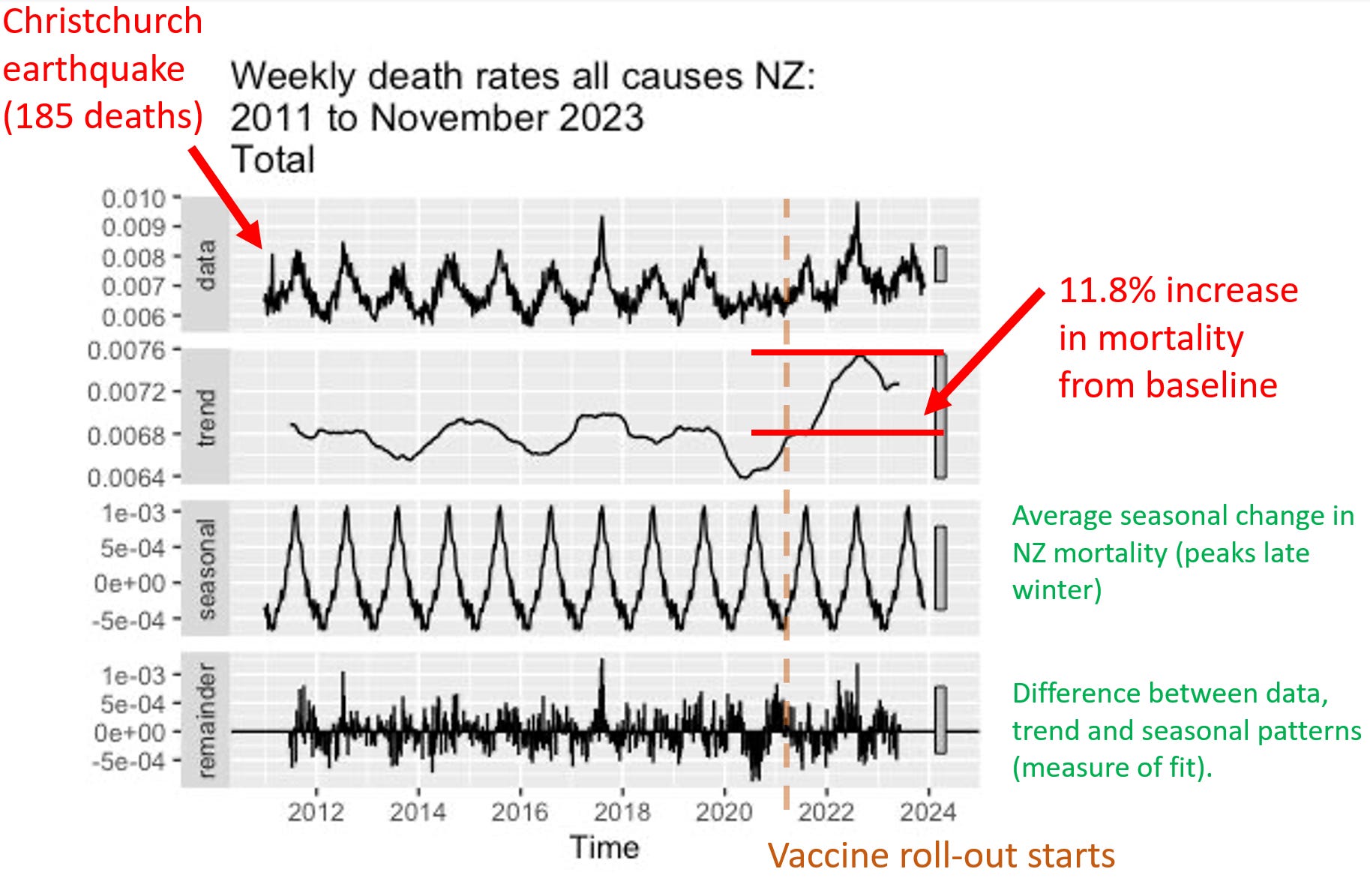
If the vaccine is safe, how to they explain this New Zealand chart? It clearly shows that deaths weren’t “returning to baseline” or “negative excess mortality” as is often claimed.
The plot below was created by an epidemiologist at a top university who wishes to remain nameless so she can keep her job. It uses the latest weekly mortality rates in NZ from official data. She used the default values for the function to make the chart. She didn’t fine tune the parameters to get the results to fit her agenda. Can you believe that? You can download the R code and the spreadsheet of data from my Github and see for yourself.
Focus on the “trend” plot below. The trend shows increase of peak, compared to baseline of 0.0076/0.0068 = 11.8% increase. The mortality rise started abruptly at the start of Q4 2021 which was right after jab rollout. A coincidence? Unlikely in my opinion.
Here’s an independent assessment of the excess mortality. This looks like a problem to me. Thing go up starting right after Jan 2021 (which is normal).

People were told deaths were up in New Zealand because the population grew. True. But they deliberately misled the public because the deaths per capita (which is what matters) increased. So even though the population increased, deaths increased even more. When they deliberately deceive the people like this and the press lets them get away with it, it is an indicator of a very high level of corruption:
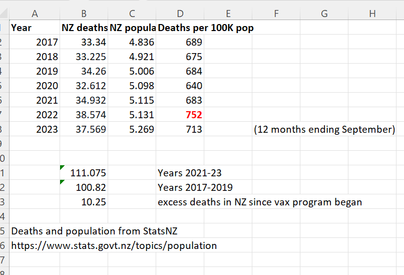
And finally, here’s the proof that the Deaths per 100K population was at a 12 year high in 2022 from the official New Zealand stats. See the number in the lower right in red.
An overview of the New Zealand data arguments
The cohort time series analysis is the definitive way to analyze vaccine death data like this. It’s what the professionals at the UK ONS use, for example.
Here are the key arguments from the time-series data in a nutshell:
- Not a single epidemiologist in the world has every called for a time series cohort analysis with weekly buckets such as the one I produced in just 2 hours using the New Zealand data. Nobody. Every in the history of the world. For any vaccine. In any country. Ever. What does that tell you? It tells you that the entire system is corrupt and bought off that there isn’t any transparency of public health data. This should make everyone furious. Every mainstream media outlet should be calling for this level of transparency so that the public learns the truth about vaccines. But they are all silent. There is absolutely no excuse for public health authorities not providing this.
- The time series cohort analysis method, used by the UK ONS, is the definitive way to analyze a real-world intervention like a vaccine if you want to know the truth. There is only one way to do it. Everyone gets the same output file. Here’s are the time series cohort analysis done by the UK ONS. They stopped doing them in August 2023, probably because the results were too incriminating. When I asked Sarah Caul at the UK ONS to publish the same data but with weekly buckets so we could see what was going on, I received no response.
- There is only one way to properly interpret a time-series analysis. If mortality climbs after every dose, regardless of seasonality, the vaccine should be stopped. Period. End of story.
- The definitive nature of the time series analysis is why epidemiologists avoid it; they are focused on pushing the narrative and keeping their job. They can’t have a clear way to interpret the data. They need something they can game that is not objective.
- There isn’t a way to interpret the HNZ time series data and conclude that the vaccines are safe. The safety signals are huge. For example, when mortality is declining for the population as a whole, if you were recently vaccinated, your mortality is going up when it should be going down. Nobody can explain how that is consistent with a safe vaccine.
- In order for the shots to be recommended, the time-series cohort analysis would have to show that we have 95% confidence that the vaccines reduced all-cause mortality. There is no possible way for any serious epidemiologist to claim this.
- Epidemiologists in New Zealand who support this analysis will lose their jobs if they speak out in favor of this data publicly. So they speak out privately.
- Dishonest epidemiologists will likely resort to the handwaving assertions that the vaccine is safe and HVE must be lasting for months. This is not supported by the data at all as I point out in the HVE section where I show that the deaths per week level off at week 3, meaning the HVE effect ends by 3 weeks.
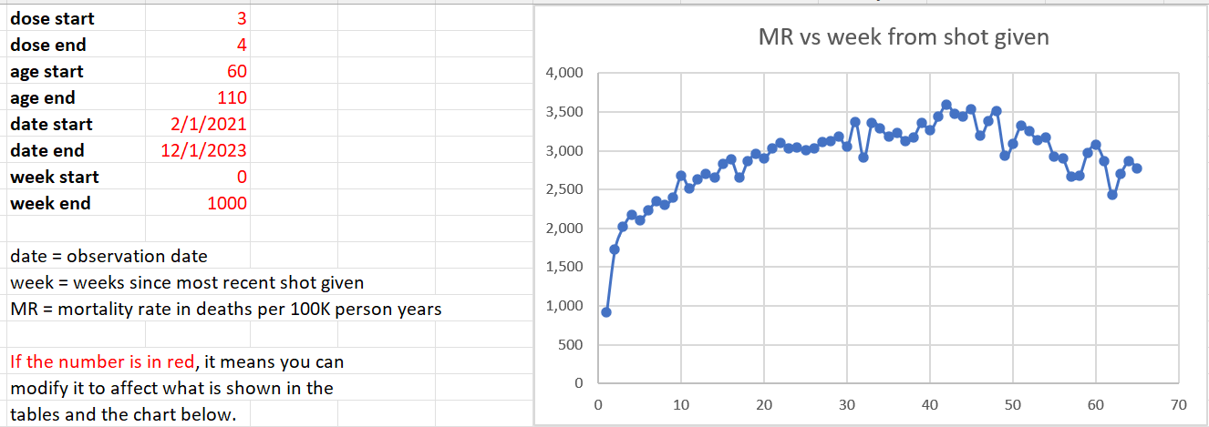
- We restricted our focus in the analysis below to 60 years old and above, because that is where we have enough data to make a determination and that’s where the deaths from COVID are. It is a the target market for the vaccine. If it doesn’t work on this cohort, it’s over.
- The mortality rate for this cohort (60 and over) appears to be from around 1,600 to to 2,400. This accounts for seasonality swings which are around a 20% plus/minus from the centerline mortality rate of 2,000 deaths per 100K person years. So anytime you see mortality rates above 3,000 for people who opted for vaccination, we have a serious problem. If mortality rates stay within this range, the vaccine is safe. In our case, we see mortalities rates as high as 4,000 deaths per 100K person years.
- The time-series cohort analysis takes into account both number of deaths and number of people in each bucket, where each bucket represents people at a fixed number of weeks from the date of vaccination. It yields a mortality rate which we can then compare to the actual measured all-cause mortality in New Zealand at the time of the shots.
- What we find is that the mortality rate in every Dose where we have sufficient data (Doses 1 through 4) exceeds what is expected from background effects based on the actual reported all-cause mortality numbers in New Zealand which takes into account COVID, seasonality, etc.
But there is more to the New Zealand data than just the time series analysis. For example:
- If you have any fixed cohort of 80 year olds and older, the deaths per week must decline. It’s pretty close to a law of nature. But it doesn’t here. It’s a stunning violation of the way death works (it turns out that older people always die faster than their rate of death increases; this is true worldwide). Death counts increase over time. It’s something you rarely see.
- New Zealand sex data: Sex differences in mortality after the COVID vaccine depend on which dose you got. That’s impossible for a safe vaccine.
- New Zealand raw death count data: The raw death counts also rise each month when date of injection is restricted to a mortality peak (see the Raw Death Count Method below).
- The New Zealand lot number analysis shown below showing deaths per week increased after certain lots were given.
To show safety, you also need to be able explain the other evidence from other countries which is consistent with what the NZ data shows
The New Zealand time-series isn’t the only data point we have showing a serious problem. The data should also be interpreted in light of other evidence which includes, but is not limited to the following:
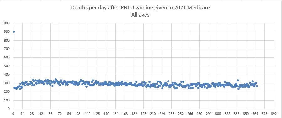
- The Medicare data puts the “HVE lasts for months” argument to rest. There you can clearly see the HVE slope vs. the vaccine slope. You can also see the HVE timescale in the pneumococcal vaccine. In both cases, HVE, which has a high upward slope, is gone after 21 days. It shows the COVID vaccine is killing people.
- There are also “impossible anecdotes” (such as Jay Bonnar) that can be 100% verified and there no counter-anecdotes. Anecdotes like that of Jay Bonnar are only possible if the vaccine is killing around 1 per 1,000 doses.
- There are no “counter anecdotes,” i.e., people who lost 5 friends unexpectedly since the vaccine rolled out and all 5 friends were unvaccinated. These anecdotes should be easy to find it the vaccine wasn’t causing these unexpected deaths. I asked for anyone who knew 5 unvaccinated people who died unexpectedly and despite 100,000 views, there were no examples. However, I did get a lot of messages like this one which to any objective observer would be hard to explain.
- The US Medicare charts show what happened over time to Medicare patients given two vaccines in the same year. In one case, deaths decline every day. In the other vaccine, death climb every day by a rate that has never been seen before. How will they explain that?
- The rise in mortality reported by the Israeli MoH mimics the rise in mortality in New Zealand and Medicare. Hard to explain away. Where is this happening with any other vaccine?
Terminology used
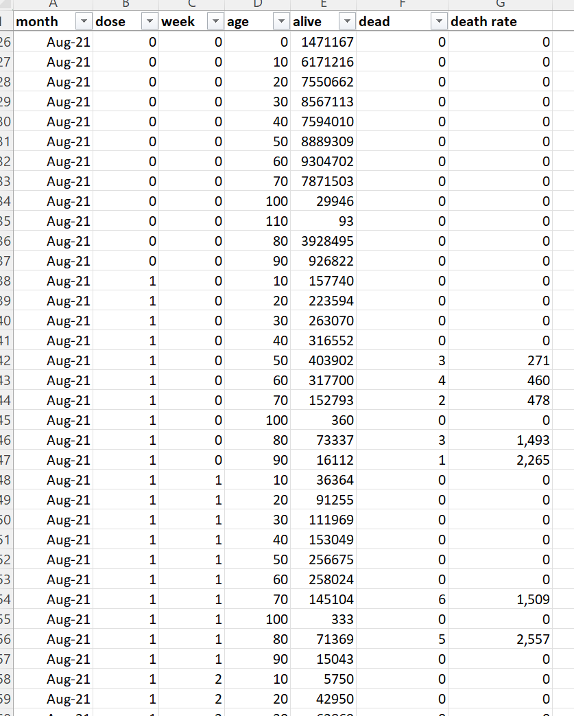
Record level data
Records are produced when people are born, die, and get vaccinated among other thing. Record-level data in this article refers to records contain the date and time of vaccination, what dose was given, and the birthdate and death date of the person. Generally, there is one record for every time a vaccination is given and those records have the date of birth (DOB) and date of death (DOD) as part of the record.
Death rate or DR
The death rate is the number of deaths per week or per month or per day. It is a measure of raw counts. This number can range all over the place and depends on what the age mix of the cohort you are following is and the number of people.
Mortality rate or MR
The mortality rate is a more normalized form of the death rate. It is expressed as deaths per 100K person-years. For example, the average mortality rate for 65-69 year olds in New Zealand is around 1,000 deaths per 100K person years. This means that 1% of this group would be expected to die in a year. So if you have 100 people in this age range at t=0, you’d expect to have 99 people alive after 1 year.
HVE
Healthy vaccinee effect refers to a 21 day period after a vaccination where mortality rates are artificially low because people who are very near death aren’t injected. But in New Zealand, this effect would be expected to be less than 21 days because every alive unvaccinated person was viewed as a threat to the living. See section below (“More on HVE”).
PPD
Pay Per Dose was the billing system the data is from. About 1/3 of all vaccinations were billed this way, slightly over 4M doses. There is no known systematic bias in who got a PPD shot.
HNZ
Health New Zealand aka Te Whatu Ora, the health agency which unwillingly provided the data to us, thanks to Barry Young. They have not published any epidemiological studies on their own data showing the vaccine is safe. Like most health agencies, they take a head in the sand approach to safety and trust the CDC.
Repository
Location of the data files from HNZ as well as derivative works to analyze the data. All this data has been anonymized so as not to reveal anyone’s personal information.
Time-series cohort analysis
A reliable method for analyzing interventions such as vaccines on a population. A database of patient records is analyzed by running through all the records multiple times (once per day). If a person is alive on that day, that person is tallied to exactly one alive “bucket”, e.g., the August, Dose 1, Week 2 , age 20-29 bucket. If the person died on that date, they are tallied to a death bucket and then no more tallies. Using this data, an appropriate visualization tool, and information about what is happening in the background (such as seasonal mortality, all-cause mortality measurements, mortality rates, COVID deaths, and more), skilled scientists can analyze the data very precisely.
|
Here’s what the output of the time-series analysis looks like (this is only a small subset of the rows).
What the data is “supposed” to look like
There are 2 major ways look at the data if you want to see a signal (and an infinite number of ways to look at the data if you don’t want to see a signal).
Here is what a safe vaccine would look like in the ideal case where a vaccine is given evenly over time.
Note: If the vaccine is given over a short period such as in this case, the described curve below will simply modulate up and down depending on what is going on in the background (seasonality, COVID outbreaks, etc); the shorter the vax period, the larger the amplitude of the swings.
- Time series, no age bracketing: You’ll see a fixed upward slope of around 10% per annum because your fixed size cohort is aging. The slope depends on the age mix of the cohort. Under 30 is 5%; under 55 is 9%. 85 and older will be 15%. This is because your cohort is aging. So if you have a mixed cohort your slope will be between these values.
- Time series, fixed age bracket: You see a perfectly FLAT line. This is because your cohort has a fixed age distribution. Every week you’ll have people leaving as they get older, but you’ll also have a roughly equal number of people coming into the bucket because they got older. The bucket is always the same age range so it always dies at the same rate over time.
- DR plots. The deaths per month plots (which are a fixed cohort defined when someone is vaccinated) will have a slope that changes gradually over time. For a full sample snapshot of the NZ population, there will be a 4.2% slope in year one which reduces to 1.9% up in year 5. If you are looking at older cohorts, the slope will be lower and can easily go negative. In general, the slope of the deaths of a fixed cohort always goes more negative over time. For 70 to 90 year olds, the slope starts at 2.8% on year 1 and goes flat by year 4, and negative after that. There is a spreadsheet in the Generic analysis section of the repository (Age Standardized deaths) that allows you to calculate the expected slope for any age distribution. It also has the mortality rates for every 5 year age group as well as the annual increase in mortality.
The healthy vaccinee effect (HVE)
HVE is often provided as the “go to” excuse for rising mortality rates after a COVID dose is given. This is untrue as I’ll explain here. The HVE is always present for every vaccine, but it’s a constant. If anything, it is shorter for the COVID vaccine, not longer. But the data I have seen shows it is the same as always.
There are two different kinds of HVE: temporal and general.
The general type of HVE says that “healthier people opt for vaccination” so the baseline all-cause mortality of a vaccinated group can be lower than the population by as much as 65% for older age groups. This doesn’t mean the shots lowered their mortality. It means that relatively healthier people opted for the shots.
Sometimes these non-temporal HVE effects can be quite large (as high as a 65% reduction from baseline) in all age groups as was shown in this paper. For example, for age 85+, the unvaxxed mortality was 18.76 vs. 6.57 for those who opted for 2 doses. That is a huge 65% reduction from the underlying baseline mortality rate caused by selection bias.
This is why, when people look at the vaccinated in the New Zealand group, they will find that the mortality rate of the vaccinated is lower than the population as a whole. No surprise. It wasn’t the vaccine. It was selection bias.
The second type of HVE is known as temporal HVE. This is also a very real effect, but it only lasts around 3 weeks. HVE results in a significant depression of both death counts and mortality rates for weeks after a vaccine is given (generally 3 weeks). The and clause is very important.
HVE is caused by an exclusion bias where people who are going to die soon are excluded from the group who opts for vaccination. The deaths per day in the population don’t change of course, but you’ve pre-selected a cohort to get vaccinated who was less likely to die in the short run.
The primary causes of this selection bias are systemic which is why it remains constant for every vaccine and in every year:
- When you are hospitalized, in general, they don’t give you vaccines. This is because vaccines challenge your immune system and they want your immune system focused on what you were hospitalized for. People in hospitals are more likely to die than a matched group of people who are not in hospitals.
- When you are in hospice, the primary goal is to keep you comfortable as you pass away, not to extend your life. Half the people in hospice are dead by day 18. The others have a very long tail (and can be in hospice for 6 months or more). The people who are dead in 18 days are not vaccinated and removed from the vaccine rolls. The hospice stats are a key reason for the HVE largely disappearing after 18 days.
Temporal HVE is often abused by people who don’t understand this and used as the way to “explain way” the rise in the raw death counts when you look at death counts after a shot is given. A dishonest scientist will claim temporal HVE lasts for many months, rather than days. This is how they explain the rising mortality rate after the shots are given because they can’t blame it on the safe and effective vaccine, so it must be the mysterious HVE which they don’t understand.
Some have even speculated that HVE is small to non-existent for the COVID vaccines such as this person:
He’s 100% certain that there is no HVE effect.
But the data shows that there is such an effect and it’s super clear, the US Medicare data being the most convincing. So nothing is every 100% certain, no matter who you hear it from, including me.
The single most important part of temporal HVE is convincing yourself it only lasts around 21 days.
Here’s a magnified portion of the deaths after a COVID shot is given where you can verify the methods below yourself
There are at least 7 different ways to estimate the time the HVE lasts, and they all give the same result when used on both safe and unsafe vaccines (~21 days). The methods are most accurate if you have lots of deaths. For our purposes, the Medicare data is the most definitive and shows the effect lasts 21 days for the COVID vaccine, which is the same as other vaccines.
- Diverging slopes intersection. You take the slope of the HVE line tangent and the vax tangent and look at where they intersect. This works well when the curve of the vaccine core effect slopes down (PNEU vax) or mildly up (such as the COVID vaccine). It fails for vaccine with a deadly response curve like the FLU vaccine because both slopes are large positive numbers just after vaccination.
- Death rates stop climbing monotonically.
- Mortality rates stop climbing each week and go down. The down point is a reasonable baseline mortality of the cohort.
- Mortality rates enter the “strike zone” for that cohort, i.e., a point 40% below the average normal mortality for the cohort normally. This accounts for seasonal variations in mortality as well as the non-temporal HVE.
- Mortality rates exceed a baseline threshold seen later in time, i.e., we are seeing a repetition of the same point or lower in a later time point. This is because the HVE values should never be repeated later in time since this is a one-time mortality reduction.
- Death rates exceed a baseline threshold seen later in time
- 4 half-lives from the start, i.e., you see how many days it takes for the HVE effect to diminish by 2X and multiply that by 4. This is a pretty good rule of thumb that works if you have little statistical noise on your datapoints, e.g., the Medicare COVID shot data above where it works brilliantly (~5 days between the first four half lives). This is because the HVE effect diminishes exponentially. So this is a great rule of thumb when looking at datasets where there is noise. You estimate the first half-life in terms of days and you have an approximate answer. 2^4 is a 16 fold reduction meaning the effect is basically de minimis at that point. You can use this method to verify the same 21 day effect in the NZ data by using Dose 4 data because the underlying mortality is going steeply down so the effect is much easier to see. The half live is around 5 days if you extrapolate between week points.
Here’s an example from the NZ data showing very clearly that HVE lasts only for 3 weeks which we can establish using multiple methods above.
Properties of temporal HVE:
- The temporal HVE effect (where people who are about to die are not vaccinated which lowers all-cause mortality in the 3 weeks after the shots are given) always gets progressively smaller over time. This is because people are good at predicting death the next day (e.g., we’ve stopped feeding the patient), but predictability goes down the longer a person is expected to live.
- People expected to live 21 days or longer are generally vaccinated. This is both to protect the living and the caregiver.
- There aren’t any examples of HVE lasting more than around 3 weeks that I’m aware of. Not for any vaccine in history. Nobody has ever produced an example of this. Instead they just attack you when you ask them for evidence like Dr. Shiva did to me. When I challenged Dr. Shiva on this on Dec 17 in a recorded space on temporal HVE, Dr. Shiva REFUSED to answer the question and I asked at least a dozen times. Instead of citing evidence, he just came back with ad hominem attacks. Start listening at 1:23:15. It’s stunning on how he runs away from answering my simple question every time. I asked for the data, he responded with personal attacks every time. This is basically how it works. No “scientist” has ever shown a paper when HVE lasts >21 days.
- HVE effect does not depend on the season
- HVE does not depend on dose
- When deaths go down in successive weeks or are flat, it is a sure sign that HVE is over
- HVE is an exponential effect. You can see this from the COVID Medicare data below. So if HVE is reducing the baseline deaths by 80% on Day 0, by day 3, we’ve reduced deaths by half of baseline. By Day 21, the impact on deaths is <1%, so it’s gone. If you look at the daily NZ death data on a per day basis, you’ll see that a factor of .8 is generous; it drops faster than in the US. In other words, it’s gone in 21 days or less.
In New Zealand, like other countries, they vaccinated aggressively. So even if you were about to die, unless you were going to die in a few days, you got the shot because they were interested in protecting the caregivers, not the patient.
NOTE: There were absolutely no instructions given in New Zealand to avoid vaccinating people if they might die soon.
You can also see very clearly that HVE lasts 3 weeks or less by plotting raw deaths after dose in New Zealand. I chose Dose 2 and 4 because there was a lot of data and it wasn’t confounded by the background seasonality effect if we looked at Dose 3 (which would make it harder to see).
Here’s the chart for Dose 4 in New Zealand where there are plenty of deaths to see. At week 3 the HVE effect is gone because we can see the deaths stop rising… Week 4 is lower than week 3 (at 235 deaths) a clear signal of the end of the HVE period. The HVE, if there is any left, has diminished to the point it is no longer able to produce an increase in deaths each week.
You can also see this from the time-series plots looking at the raw death chart (and not the mortality chart) where the deaths per day stabilize and cluster starting at week #2. Note below that the week 8 number is the same as the week 2 number which suggests the effect ends at week #2 and using the mortality at Week #3 as a baseline (218 deaths in the table below) is a reasonable estimate since in the 5 weeks since then, only one observation was higher than 218 deaths (and it was higher by less than half a std deviation). So the week #3 mortality is likely representative of the group shortly after the vaccine was delivered to the group. You can confirm the HVE effect is over in the mortality rates as well since you see mortality rates are lower after week 3 in the chart below.
Here were the parameters I used:
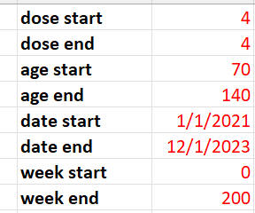
I chose 70 and older since older people are much more likely to be subject to HVE. I chose Dose 4 since the seasonality acts against the mortality rise of the vaccine so the signal would be easier to see.
Why the death rates of an elderly fixed cohort over time always decline over time
Study this table. What you find are two things:
- By age 86, the average mortality is 10% per year or higher.
- On average, the increase in mortality per year is around 10% give or take.
These are two opposing forces. The first one causes the number of deaths per week of a fixed cohort to decline by that percentage per year. The second one acts to increase the number of deaths per week.
At age around 85, these forces are in equilibrium and the death rate is relatively flat for a fixed composition cohort at t=0 followed over time.
For ages > 85, the slope is down. The older the cohort, the steeper the slope.
For ages <85, the slope is up. But the slope can NEVER increase by over 10% per year no matter what due to point #2. This is critical. So when we see the deaths at the end of the year 25% higher than at t=0, we know we either 1) have a deadly vaccine or 2) there is a huge background effect that is causing the lift.
For real world cohorts, such as Medicare, for any practical Medicare cohort, the slope is always flat to down. But for the COVID vaccine it is up by 25%. It’s stunning.
We’ll see this later on when we talk about Medicare.
The gaslighting arguments
People will try to gaslight you into avoiding looking at the New Zealand data.
I’ll address these techniques in a subsequent post.
One of my favorites is this response to the unambiguous huge signal on Dose 4: “there must be confounders” which you can see here:
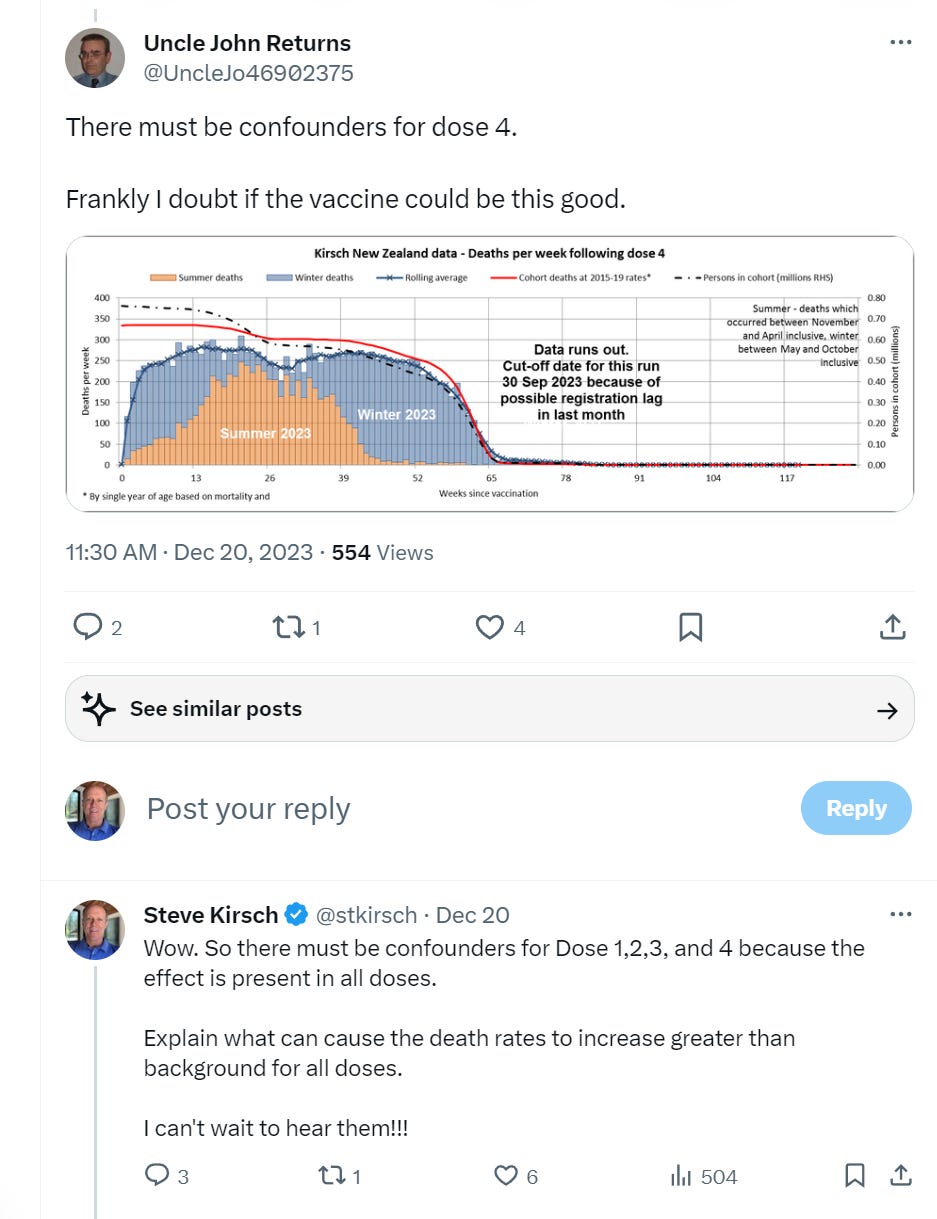
This is the closest you’ll ever see anyone on the pro-vax side admitting that they were wrong. They’ll always come up with a fallback like this when their narrative falls apart.
Real scientists find value in any data
A real scientist figures out a way to benefit from any data they receive. They never throw up their hands saying “nice data, but there isn’t a control group so it cannot be analyzed.”
A real scientist will always find a way to maximize the value of any data they get. Sadly, there are too few of these scientists nowadays. See this excellent article by Norman Doidge for more on this. It’s one of my favorite articles.
The New Zealand data is a strong teaching point: it show you just how corrupt the system is that in the 3 weeks since I made the data available, not a single epidemiologist has said, “this data is consistent with a safe vaccine.”
Instead, they all keep their mouths shut and say absolutely nothing about the definitive time-series cohort analysis that was done. Most people ignore it and proclaim their own analysis method is the right approach. It’s because they can’t refute the time-series analysis.
Things you should know before looking at the data
- NOBODY has found an error in the extraction code or the visualization spreadsheet. In fact, the extraction code (buckets.py) has even been independently replicated from scratch and found to be error free: “We re-wrote Steve’s approach in a different programming language in order to learn the intricacies of this approach. We were able to perfectly match Steve’s results (at the underlying fine-grained “bucket” level), give-or-take some floating point precision differences between the runtimes.”
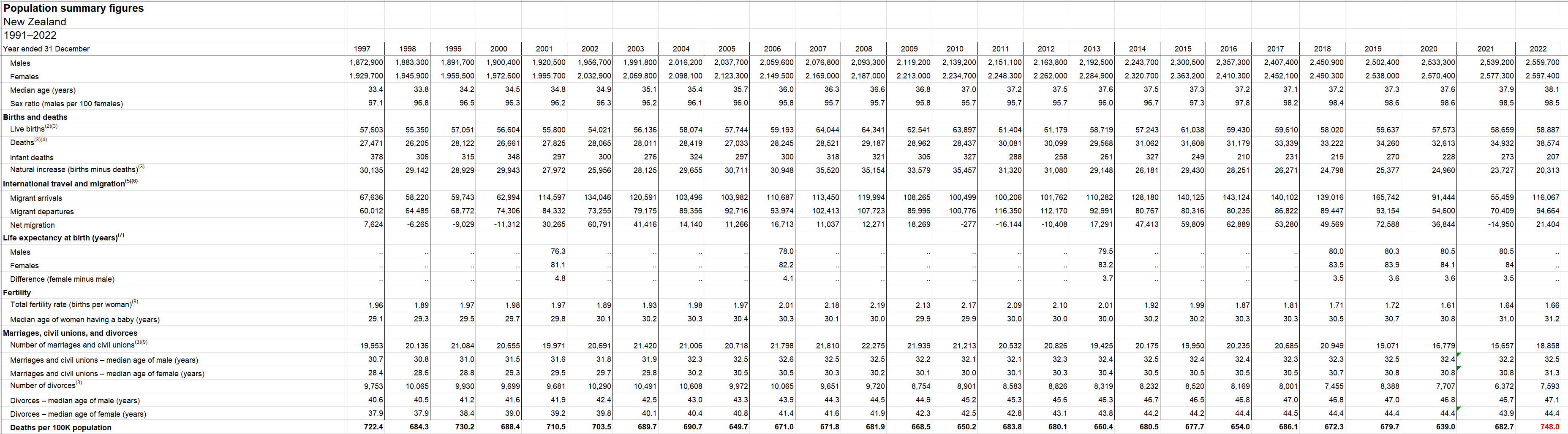
- Here is the vaccination schedule in New Zealand from the Health New Zealand site:
- Death numbers by month and sex are found here: Monthly death registrations by ethnicity, age, and sex: January 2010–September 2023 which can be found on this page.
- Seasonality is very small for people under 60. It’s mostly Poisson noise. If we look at all the people dying in New Zealand, seasonality can make a huge difference in all-cause mortality from peak to trough of 50% as happened from Feb to August 2022 (a rise) and then again from August 2022 to Feb 2023 where it went back down by a similar amount. This is the largest seasonal effect during the vaccination period and can be used to compare with what is happening to the vaccinated during this time. If the vaccinated flow with the trend, the vaccine is safe. If the vaccinated die higher than the trend, the vaccine is killing people. If the vaccinated are dying lower than the trend, the vaccine is saving lives.
- 80 year olds (and older) double their mortality rate over 5 years. This is a 15% mortality increase over 1 year and a 7% increase per year. This would be considered very normal. So if nothing is going on in the background (like seasonality), we should expect to see the mortality rate line increase by no more than 7% in 6 months.
- The cohort time-series analysis is used by the UK government to assess vaccine safety because it computes accurate mortality rates. If the vaccine is given evenly over a 1 year period (which wasn’t the case here), the mortality rates should increase by 7% evenly over 6 months.
- In the cohort time-series analysis, older people tended to go for their next dose starting around 5 months after getting their shot. This is why the mortality rate begins to level off and starts declining at 6 months; it’s a Simpson Paradox effect because the age of the cohort after 6 months is becoming younger and younger. This is because after 6 months, old people recycle to the next shot. Say in 12 months, all the old people opted for the next shot. So at 12 months, the cohort is very young. So after 6 months, the cohort left in the “after 6 months in that dose” are younger and younger over time. However, if you restrict your view to those within a narrow age range, such as 60 and older, you see a completely different story: mortality continues to rise monotonically for around 1 year since the shot was given which is stunning. This happens for Dose 3 and 4, as well Dose 2 to 4 and Dose 2 to 5. Dose 1 can be added to any of those ranges as well and doesn’t change anything. So what is stunning is Doses 3 and 4 are given at opposite calendar dates (6 months apart) so in one case you benefit from seasonality and the other you don’t, so the two doses should cancel each other out from a mortality point of view.
- So looking at doses 3 and 4 if the line slopes higher than 7% in 6 months you have a huge problem since these two cohorts roughly cancel out the seasonal mortality since they are 6 months apart. In fact the Dose 4 cohort (where seasonal deaths are dropping) is actually 20% greater than the dose 3 cohort (3.6M person-days in week 0 for dose 3 vs. 3M person days in week 0 for dose 4). The seasonality effect for Doses 3 and 4 are equal and opposite.This is male and female deaths per month for 12 years. Note how in 2022, the peak deaths are at a unprecedented rate. They never point that out!!! Source: https://www.stats.govt.nz/assets/Uploads/Births-and-deaths/Births-and-deaths-Year-ended-September-2023/Download-data/Monthly-death-registrations-by-ethnicity-age-sex-Jan2010-Sep2023.xlsx
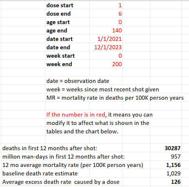
About the data below
All the screen shots are from the v4 spreadsheet with can be found in the analysis directory of the repository. The data in that spreadsheet were generated from buckets.py (found in the Code directory) applied to the original .csv file with the 4M records (found in the-record-level-data directory).
So you don’t have to believe me. You can verify this yourself.
I confine my analysis to those age 60 and over to avoid Simpson paradox effects (since a lot of young people didn’t get jabs after dose 2 and that would pull down mortality because the “after 6 month” cohort would get dramatically younger).
Overall mortality rate for New Zealand for the entire population is around 680 per 100K, but it rose to 752 overall after the vaccines rolled out, a 10% rise.
But since we are looking at ages 60 and above, so the mortality will be much higher. Mortality for this age group can range between 1,628 and 3,000 depending on what is happening in the background (like deaths from the vaccines and seasonality and how vaccinated people were; lower mortality at the start of the vax program and significant higher mortality for the same cohort after they got more doses).
For example, for Doses 1 and 2, mortality ranged from 1622 to 2586 (see the dose1.xlsx and dose2.xlsx spreadsheets).
But for for Dose 3, the Q1 rate is 2,080 and the Q2 rate is 3,021. You can see this in the Dose3.xlsx spreadsheet in the repository.
For Dose 4, the mortality rates ranged from 2,274 to 2,652 because we are fighting the seasonality trend so the rates will be more compressed as expected.
It certainly appears that our 60 and older cohort mortality rose over time. This should be very a very concerning red flag.
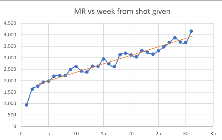
Dose 1 analysis
From the chart above, people got Dose 1 in around September 2021 when mortality rates in the elderly have already started to fall and reach a minimum in February 2022.
Look at the first 5 weeks in this graph. Does this look like mortality rate of the people who got the shot are falling? No way. It show a huge safety signal.
Only the first five weeks are reliable here because after that, the death numbers drop below 34 deaths because these people are moving over to shot 2 after 3 weeks, just like they are told.
There is no Simpson’s Paradox in the first 3 weeks since the cohort age mix is stable.
Look at the rise in the first three weeks *the first three dots). Mortality climbs from 766 (week 0) to more than double to 1,620 (week 2). This is all temporal HVE which lasts 3 weeks. Nothing to be worried about here. This was totally expected. We hit baseline mortality in 3 weeks after the shot which is normal.
What’s unexplainable is the rise above 3,000 (deaths per 100K person years). That is trouble with a capital T. That’s very hard to explain, even with a very strong seasonality effect for 60 and older in New Zealand.
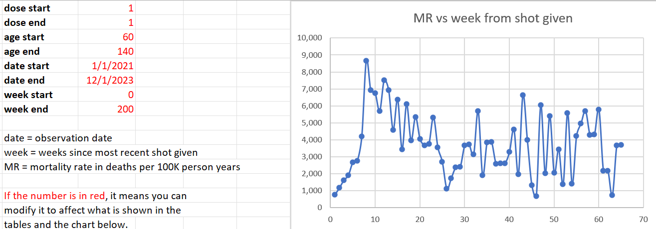
Note that the total deaths here past week 5 are small, so the numbers are noisy but the trend, even with the noise, is above 4,000.
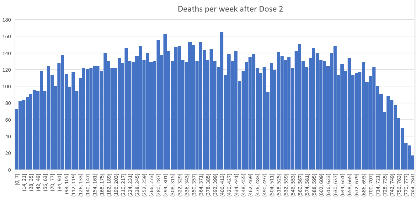
Dose 2 analysis
These happened in October 2021, 3 weeks post Dose 1 so, like Dose 1, we’d expect a strong downward bias on mortality rate over time due to strong seasonality effects on the older cohort.
This is not nearly as big an effect as for Doses 3 and 4. It reaches a minimum in February 2022 (at week 16), then we see background rates start to rise from there so by April (week 24) we are about even with rates at the start of the period.
So what happened to mortality at the start and end when background deaths are flat?
Week 23: 2,986 (April, 2022 deaths are 3042)
Week 3: 1,621 (November, 2021 deaths 2952)
Wow. Mortality went up a whopping 84% even though the background death rates on those two points went up by 2%. That’s really stunning.
Note: Week 23 shows as point 24 in the graph because of the way Excel did the graph. I’m using Week 23 from the v4 spreadsheet.
By the 4th week, we have a mortality of 1621 which is within our normal range for this age. The rate should never climb above 3,000 but look at what happens after week 20. We have a serious problem. At a time when deaths should be declining by 20%, we are seeing deaths climbing
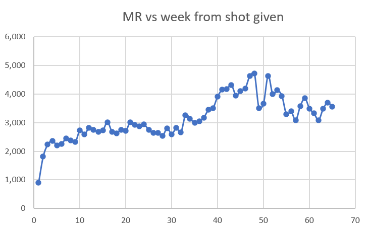
Dose 3 analysis
Dose 3 was given Jan-Feb 2022. Here is what happened 6 months later in the background deaths:
Feb 2022: 2607
Aug 2022: 3972
Here’s where we aren’t fighting the trend; where death rates are going up. The question is: do mortality rates in the cohort go even higher than the 52% increase we’d expect from seasonality?
Baseline mortality rate: 1,936 (week 3)
Peak mortality rate: 4,161 (week 30)
Ratio: 2.15
Expected 1.5
In other words, the vaccine generated a 43% excess mortality at the end of the day in an uptrend. So it seems like no matter what is happening in the background, if you’ve had the shot, your mortality is going up.
Some people might claim that week 30 is an unfair comparison week because by week 30, almost 1/3 of the people had migrated to get the next dose leaving the “unhealthiest” behind. But that doesn’t seem to be the case for several reasons:
- As you can see from the chart below, the slope isn’t changing at all after week 20 when people started to migrate to the next dose; it just kept climbing at the same rate. If the “unhealthy were being left behind” then we’d expect a shift upwards.
- If we compute the HVE effect magnitude for Dose 4, it’s around 150 that were “left behind” in the Dose 3 cohort that would artificially increase the mortality rate. Those 150 are roughly evenly distributed over time so let’s be very conservative and assume it was distributed over 7 weeks. This would add 21 deaths to each of the weeks. So Week 30 with 2,061,416 man days and 235 deaths should really be 214 deaths which gives a mortality rate of 214/2,061,416*365*100000=3789. So 2.19 becomes 1.96 which is still a 30% increase over the expected 50% seasonality increase in mortality (which is very conservative since it would never be as large as the peak to trough since the vaccines were given over time which would tend to diminish the seasonality extremes).
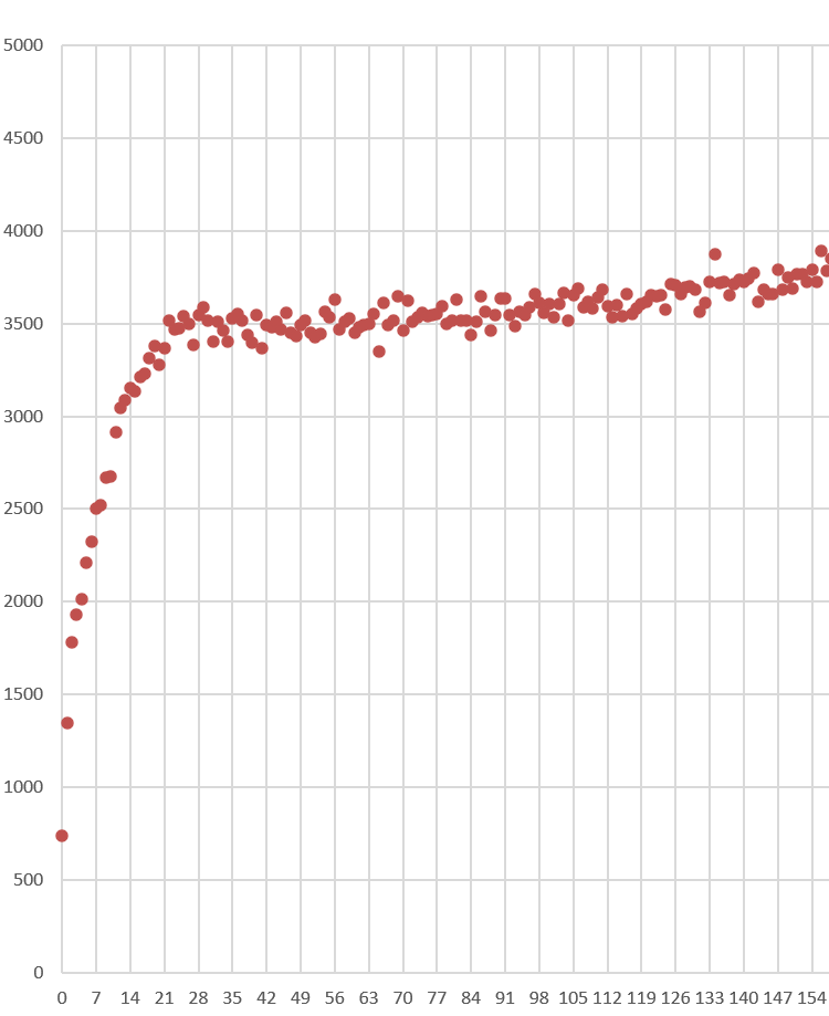
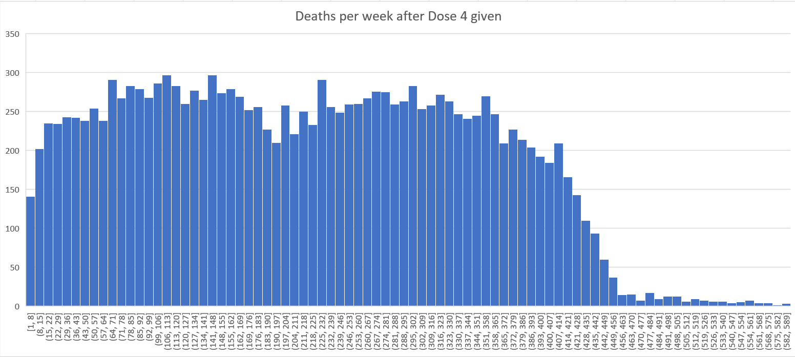
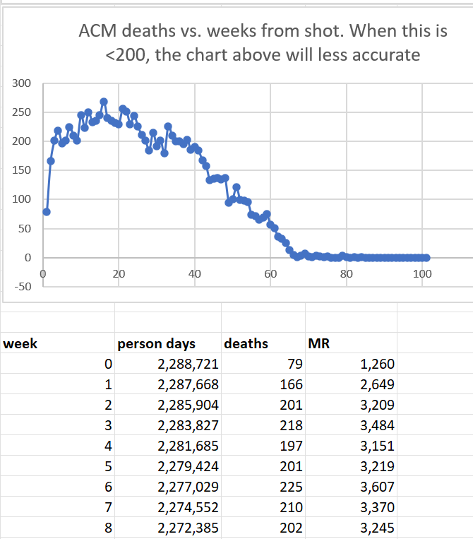
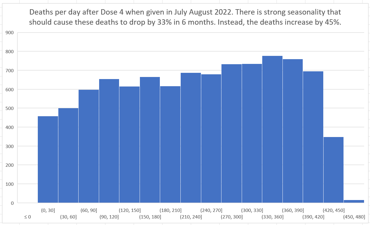
Dose 4
Dose 4 was given in July and August 2022, when deaths are at a peak. So in the next 6 months we are going to be experiencing a huge downdraft. So if the line is sloping up, we have a very deadly vaccine. Guess what? The line has a small upward slope. We have a deadly vaccine!
With Dose 4 we have a lot of data and the slope of the mortality effect is relatively flat due to the downdraft, so we can now very clearly see the temporal HVE which was harder to see clearly on earlier doses. After the third dot, it’s over. The fourth dot goes up (statistical noise) and the 5th dot is lower than the third dot confirming, once again, that HVE ended by the third dot, i.e., that the HVE (which is a very strong effect) is largely gone by the end of week 3.
Week 3: 2,370 mortality rate
Week 24: 2,741
Yet deaths in a month go from:
August 2022: 3972
Feb 2023: 2,691
So our peak is 47% higher than the trough.
Let’s do a Fisher Exact test on this using the death numbers 6 months apart to see if they track and the differences are statistically significant.
Our Fisher matrix using weeks 3-6 and 24-37 (without normalizing for the cohort size to be super conservative is (3972, 919, 2691, 907)
Statistics for dose 4 3972 919 2691 907 8489
One-sided p-value 8.4287274053816e-13
Two-sided p-value 1.5944061943595884e-12
Odds ratio= 1.4566920525719358
95% Confidence Interval(low=1.3110223439620594, high=1.6185720629913125)
So it is virtually certain that the disparity didn’t happen by pure chance. Something caused a very large shift.
Doses 3 and 4 combined
From the chart above (the seasonality chart), we can see that the seasonality effect for 6 months following doses 3 and 4 are equal and opposite. So combining doses 3 and 4 as we show below should show a relatively flat line since the even a 12 month 8% mortality rise due to age effects (the cohort is a year older after 52 weeks) would be nullified by the 20% larger cohort size for Dose 4 (where mortality is falling).
Looking at this over the first 24 weeks when the effects should more than cancel out so that basically the background deaths are dropping, we see an increase from
Week 4: 2,109 (so we start after HVE is gone)
Week 24: 3,008
This is a whopping 43% increase in mortality at a time when the background death rates should be going down.
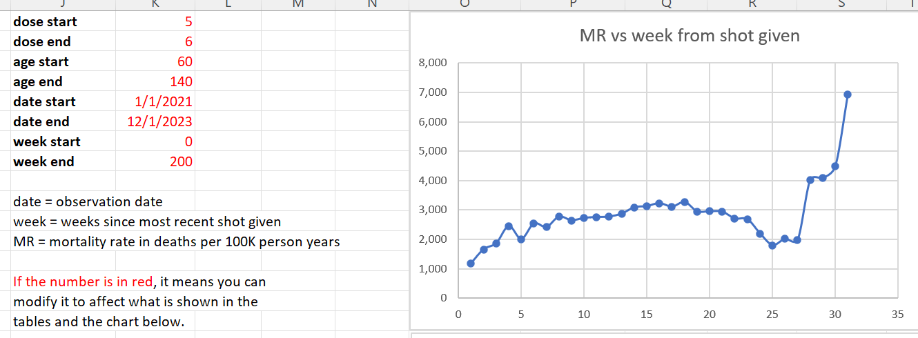
Dose 5 and 6 combined
These doses are out of phase as well (6 month apart). We combine them to get higher numbers. However the bulk of the effect is for Dose 5. Again, mortality rates move above 3,000 for a month which should be very concerning.
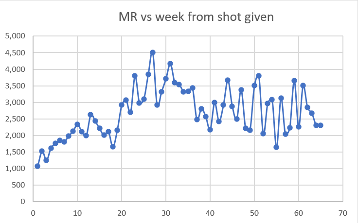
Doses 1 through 4 combined
The slope goes up even though there are more than 2x as many man days when seasonality has deaths strongly declining in New Zealand in the first 16 weeks. Doses 1,2, and 4 were giving when deaths were declining.

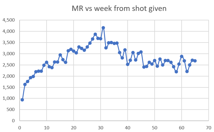
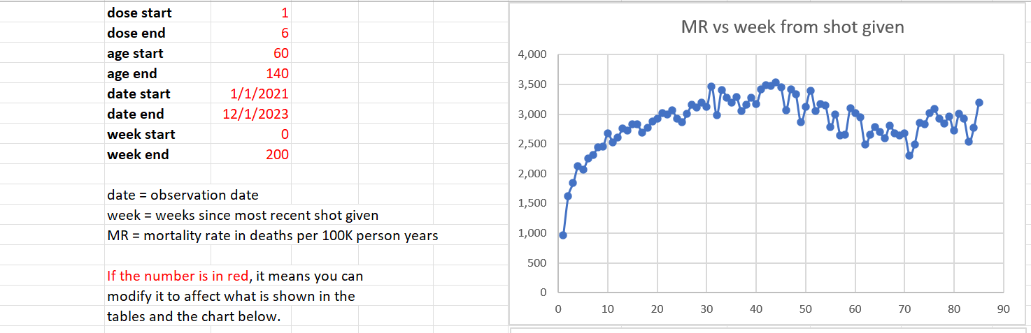
All doses over all time (ages 60 and older)
But as you can see, our 60 and over cohort never returns to their baseline mortality rate of around 2,000 even 80 weeks out from the shot. That’s a problem.
Over time this cohort gets younger because the oldest people die off. But we never have a return to baseline mortality rates established at week #3 (slightly above 2,000).
Raw death count method examples
Raw death numbers when measured from the date of vaccination (i.e., the x-axis is the days from dose) is another very powerful technique. Here, both the size of the cohort and also the age mix of the cohort is fixed at t=0. The death rate from that point should track seasonality if you restrict your cohort to being vaccinated in a specific month. From the graph below, as you can see, the death rates (deaths per day) increase by 48% when they should be falling by 33% because Dose 4 was given when mortality peaks in July-August in New Zealand. So how can deaths go up?
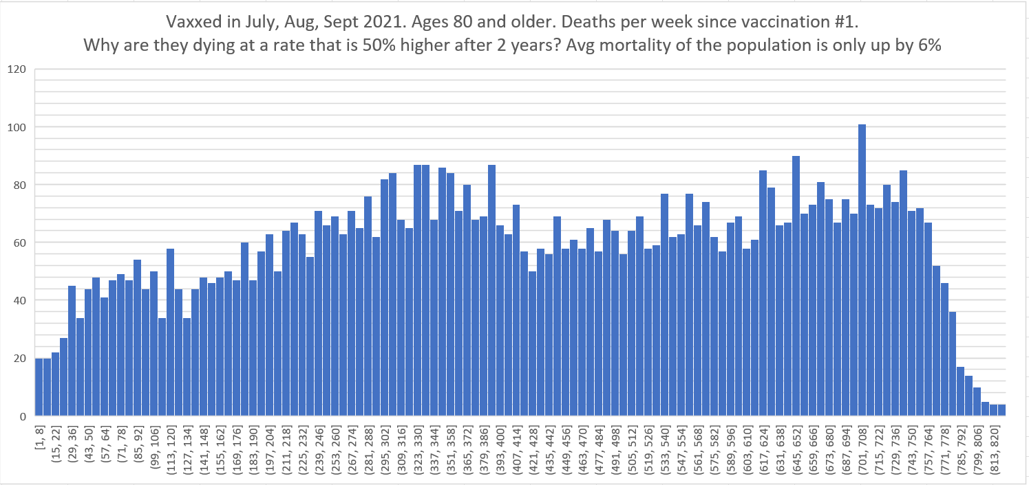
Below is another stunning example. This is people 80 and older who were vaxxed in Jul, Aug, Sept 2021 showing the number of deaths per week since shot #1 was given (regardless of any other shots). Those are peak death months in NZ. Two years later, there’s another death peak; 6% higher. Yet the deaths per week 2 years after the shot are running around 50% higher than at baseline. This is impossible for anyone to explain because there should be fewer people dying each day in that age range because the mortality of the cohort exceeds the annual increase in mortality of the cohort. This is why the deaths in the pneumococcal (PNEU) vaccine below decline every day.
The Lot number analyses are truly stunning
I have been focused on the big picture (the time series cohort analysis).
I have not had a chance to look at the lot number analysis in detail. There are 124 lots to look at.
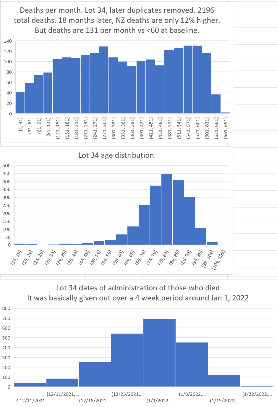
Here’s an example of a huge safety signal in Lot #10 (corrected as of 12/28/23 to eliminate duplicates):

This pattern is impossible for a safe vaccine. I really don’t need anything more than this one chart to prove the vaccines are unsafe.
But here’s another one with the same story: an impossible rise in deaths per month at the 1 yr and 18 month mark. Deaths should be heading down not up.
And you will find this same pattern in every country, in every season, after every COVID vaccine: the deaths are supposed to trend down, but they don’t.
Analysis by sex
People notice that females are more likely to be injured by the COVID vaccine, but males are more likely to die.
Do we see a difference in how males and females die relative to the shot? If so, we have an unsafe vaccine. We do!
See this article:
8 months ago · 410 likes · 190 comments · Steve Kirsch
New Zealand headlines
The mainstream media in New Zealand is 100% pro-vaccine.
So when you see headlines in the mainstream New Zealand media like this, you have to take it very seriously:
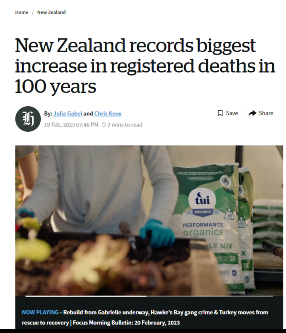
And then there is this headline:
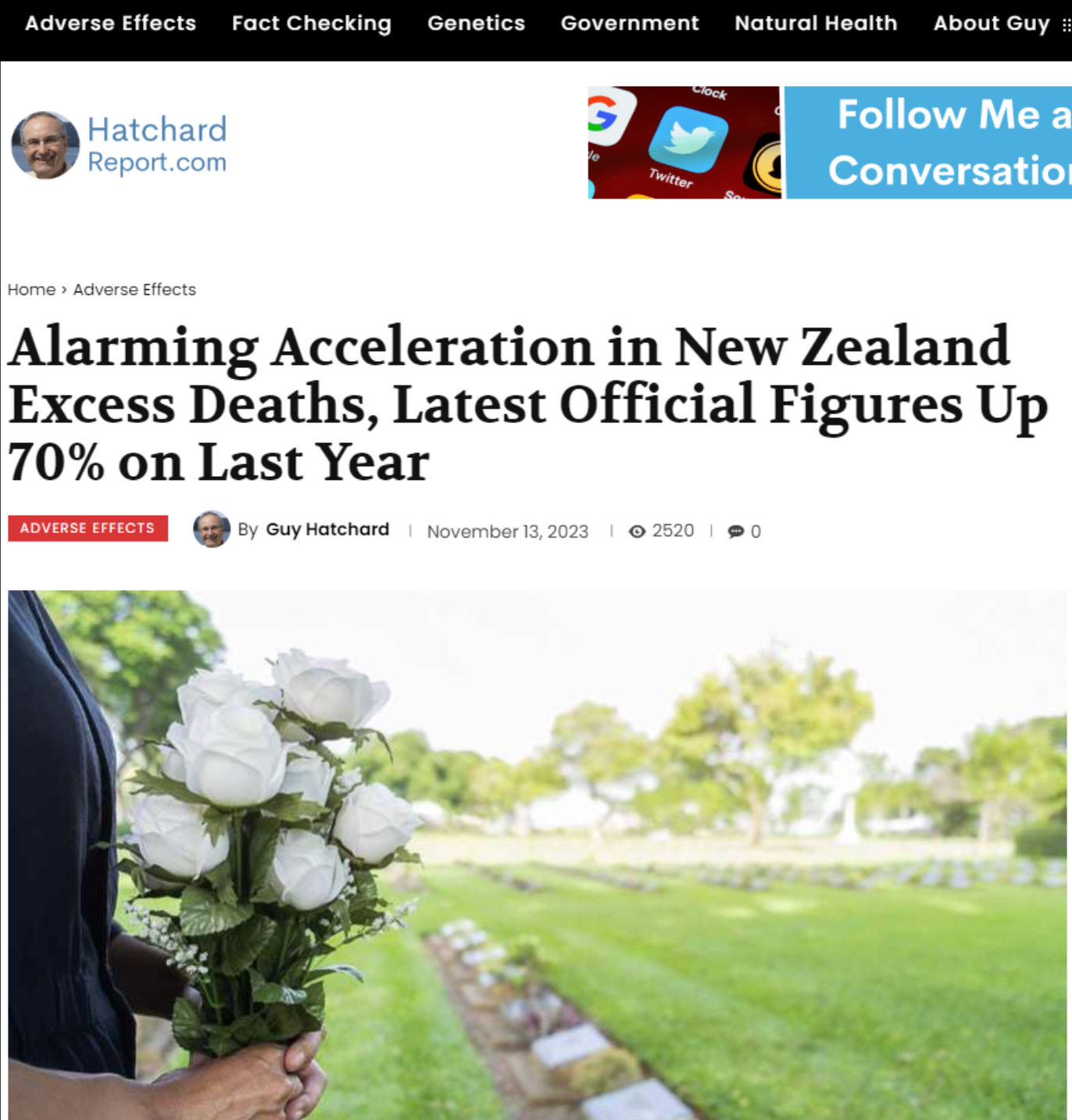
So clearly I’m not alone in believing there are excess deaths.
The US Medicare data
As a sanity check, we looked at the deaths since dose in Medicare and found a similar issue: the deaths increased over time at a impossibly high rate that cannot be explained:
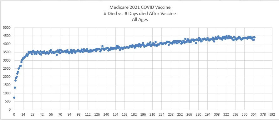
Note also in these plots that the temporal “healthy vaccinee effect” ends around day 21. This is quite obvious from the COVID data.
For the PNEU curve, this curve acts as expected with fewer deaths every day. This is appears to be true for all general population or elderly cohorts. The reason for this is that the people who mostly die are generally 80 and older and their annual mortality exceeds the annual increase in their mortality so fewer people die a day because there are fewer people available to die if you are starting with a fixed size cohort. Restricting the cohort to those 80 and older ensures a downward slope for deaths per day (subject to some seasonality waves if the cohort is vaccinated over a small number of months).
If you restrict your cohort to ages 65-75, there is a slight downward slope in deaths per day. If you allow ages above that in your cohort, the downward slope increases.
There are very few people in the world who are aware of this effect.
Data from Israel
Israel had a similar experience. Deaths per day after a dose are supposed to slope down like we saw very clearly in the Medicare chart above.
Here’s what happened to deaths per day after Dose 2 in Israel: deaths per day went way up. Either something huge happened in the background that exactly corresponded to 40 days after the elderly got their shots and was sustained for 5 months, or it was the shot.
I wonder what it could be? It couldn’t be COVID, because all these people were 30 days after their second dose of the vaccine and you can’t die from COVID if you’ve had the vaccine as everyone knows (just kidding).
More importantly, starting from March 1, 2021 for the next 5 months, deaths from COVID were falling. So it couldn’t be COVID causing the rise in the chart above.
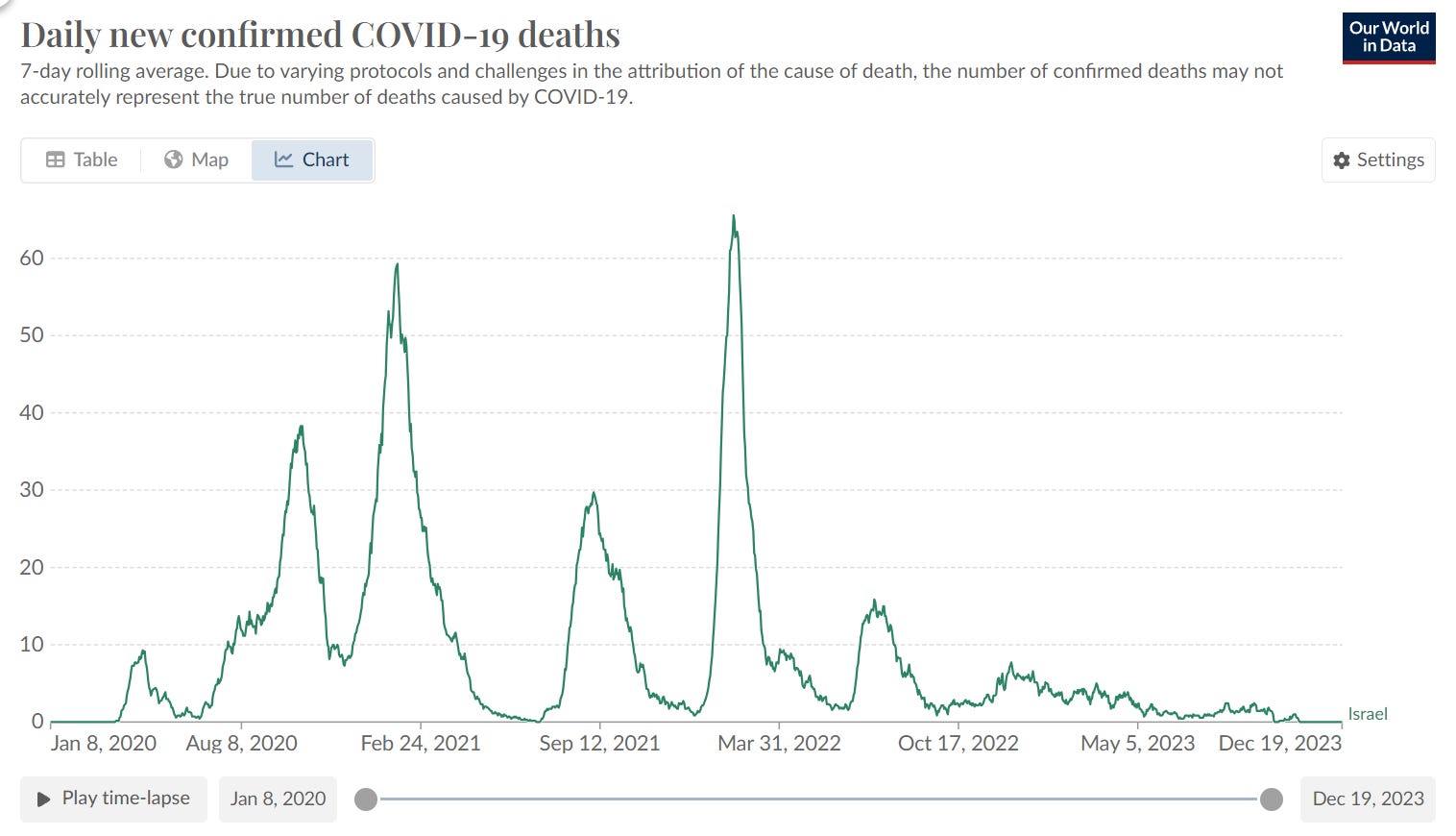
The original Israeli MoH report can be found here. Here’s the English translated study. Look at the very steep and sustained rise in the number of deaths after the shot is given. And this can’t be caused by COVID because they have all been doubly vaccinated! So what is killing these people? The steep rise is correlated with vaccine administration since this chart is relative to the time Dose 2 was given.
The report covered people who got the shot from Jan 2021 to October 2021.
Like all studies of death since dose, it’s a fixed cohort on Day 0: fixed in size and age mix. Between Dec 19, 2020 and Mar 16, 2021, about 90% of all initial vaccinations (dose 1 and 2) were given. That means the cohort death rates should show some seasonality.
During the 3 months of vaccination (Jan to Mar), the death count in Israel averaged 4,138/month. The next 3 months averaged 3,300. The next 3 months were 3,666/month. So we should see deaths dip in the first half of the chart, and then rise in the second half. But we don’t see that at all. We see deaths that defy the background all-cause mortality if you were vaccinated.
The Israeli scientists speculate that HVE causes the steep increase in the number of deaths after day 36. They cite no evidence for that and want us to believe that everyone in Israel could precisely predict when they were going to die for the next 36 days, and then their magical predictive skills simply evaporated if it was over 36 days.
As we noted in the HVE section above, HVE doesn’t work like that. The biggest reductions in death are always on Day 0, and the savings get smaller and smaller each day after that, exactly like the first 21 days in the Medicare data above. The effect is quite strong so as soon as you get a lower count on a per day basis (in Medicare where the numbers are high), the effect is basically gone. The HVE effect appears gone in Israel by Day 7. They basically vaccinated everyone who moved.
So how do they explain the huge rise in mortality from Day 30 to Day 50?
This was never explained in the report. They just glossed over it. Which tells you everything you need to know.
Younger ages
We don’t have enough deaths in these groups to make a clear determination. However, there are clearly signs something may not be right when we get more than a 20% higher mortality rate after vaccination than the background rates.
For example, for 20-24 year olds, the mortality rate post Dose 2 can be as high as .86 deaths per 1K person years when measured over a 180 day period. The 2022 New Zealand mortality rate for that age group is .55 which is a 56% mortality increase.
Kill rate on average
Using the v4 spreadsheet we can estimate the effect of the average dose on mortality
This is one way to get a rough estimate. It means that the vaccine kills about 1 person for every 1,000 doses on average. This suggests that in New Zealand that there were 12,000 excess deaths. It’s unlikely this estimate is off by more than a factor of 2. It’s certainly not off by a by a factor of 10.
Which means at this point, we are rearranging deck chairs on the Titanic. The vaccines should be immediately stopped.
The 1 per 1,000 estimate is very comparable to numbers using other methods including VAERS, polling Americans as Mark Skidmore did, or looking at countries where confounders are minimized as Denis Rancourt did, or looking at large numbers of countries like Mathew Crawford did (he estimated .411 deaths per 1,000 doses).
Other proposed explanations for the excess mortality
People have suggested that the excess deaths (assuming they acknowledge that they exist), are due to:
- COVID
- Immigration that changes the average age to be older
Some of the excess deaths in New Zealand could be ascribed to COVID. OWID lists 3,600 deaths. We pointed out before that the absolute number was significantly higher than that.
Some deaths could also be due to an age mix in New Zealand changing. People who make that argument never actually show any data backing their statement. Why would they not do this?
Errors
If you have found a material error or have an improved way to analyze the data, please feel free to reach out to me using the Contact Me instructions on my X account.
Summary
Getting a COVID shot dramatically increases your risk of death. This happens for each and every shot. I’ve calculated the p-value in one of these instances to show it a certainty that the COVID vaccines are unsafe.
Using a standard technique used by the UK Office of National Statistics, we showed that after every dose of the vaccine, the mortality rates increase relative to whatever the all-cause mortality rates in New Zealand were doing at the time. Thus, we accounted for all COVID deaths, return to baseline mortality effects, seasonality, and more because we used the actual mortality statistics reported by the New Zealand authorities as the control group.
Even more stunning is when we combined doses 3 and 4 which had equal and opposing forces happening in the background, we also saw a very strong increase in mortality over time since the shot was given.
Here we limited our analysis to ages 60 and older where we had sufficient data to make a clear assessment. But this was the very age group that was targeted by the vaccine. What we showed is that the COVID vaccines have killed thousands of people in New Zealand which translates to over 10M people worldwide..
If New Zealand were to release all the records instead of just 1/3 of the records, we could do an assessment for even younger ages.
Unfortunately, this seems unlikely as it would expose the fact that the health authorities were advising parents to kill their kids. This is why they will fight to keep the full dataset secret and keep the public in the dark.
These epidemiologists now have an interesting task ahead which is to show everything I wrote is exactly the opposite of what I described. They will show you that the NZ data shows with at least 95% confidence that the vaccines lowered all-cause mortality. If they can’t do that with this data (which is more than enough to see an impact), they should halt the vaccine. I cannot wait to see their work